Add Storybook to your Web Component project
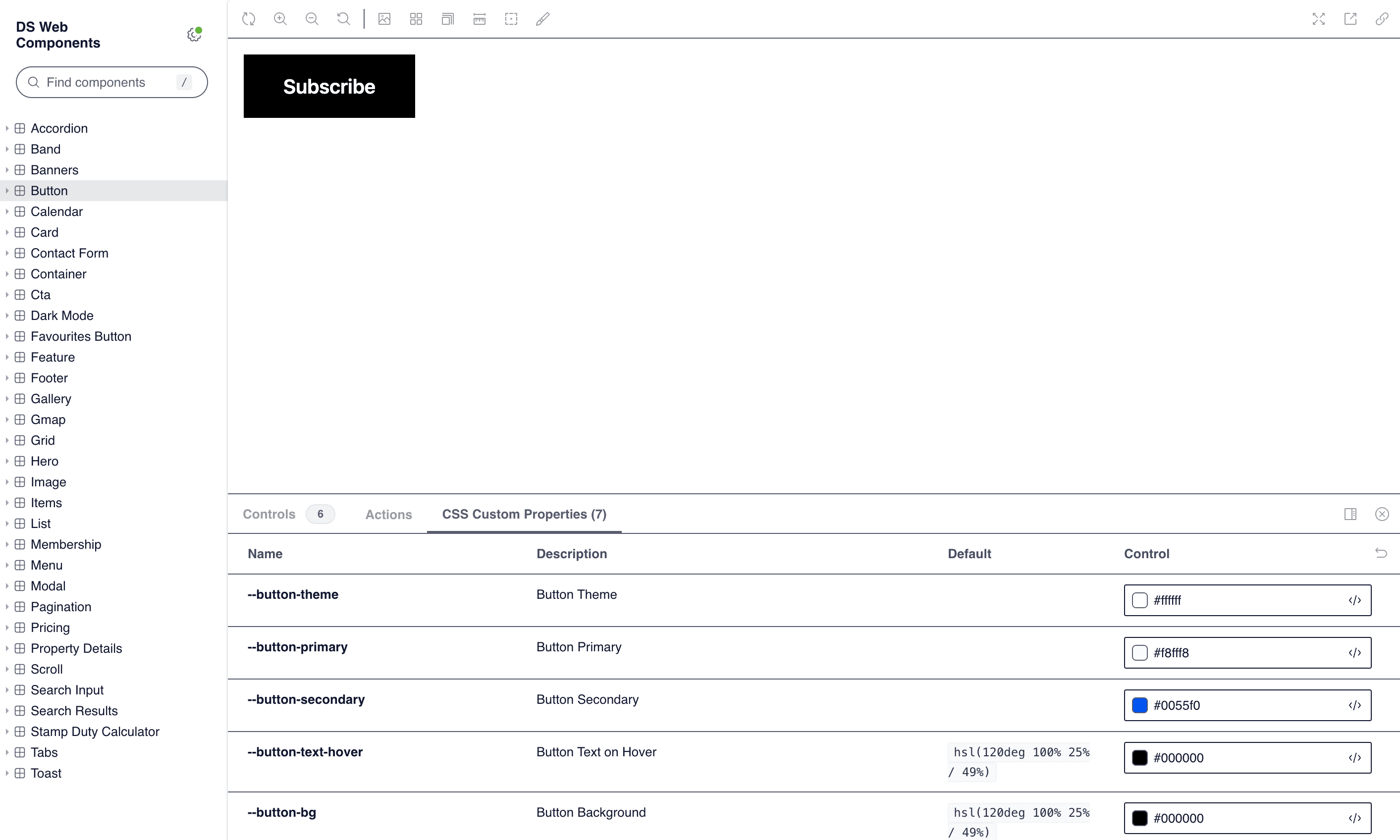
When developing complex web component libraries, ensuring consistent styling, functionality, and documentation across each component can be challenging. Storybook offers a powerful solution by allowing developers to visually organize, test, and document individual components in isolation. Integrating Storybook into your web component project enables a smoother development experience, making it easy to preview each component's behavior, experiment with different states, and even gather feedback from team members before they’re added to the main codebase. In this article, we’ll walk through the steps to seamlessly add Storybook to your web component project, enhancing both your workflow and your team’s collaboration.
Environment setup
To add storybook to your project simply run the following command in your project directory.
npx storybook@latest init
It will guide you through the setup process. There're specific options for your project type. For more information and specifc framework instructions check installation instructions here: https://storybook.js.org/docs#install-storybook
When adding storybook manually do not forget to --save-dev to npm install command.
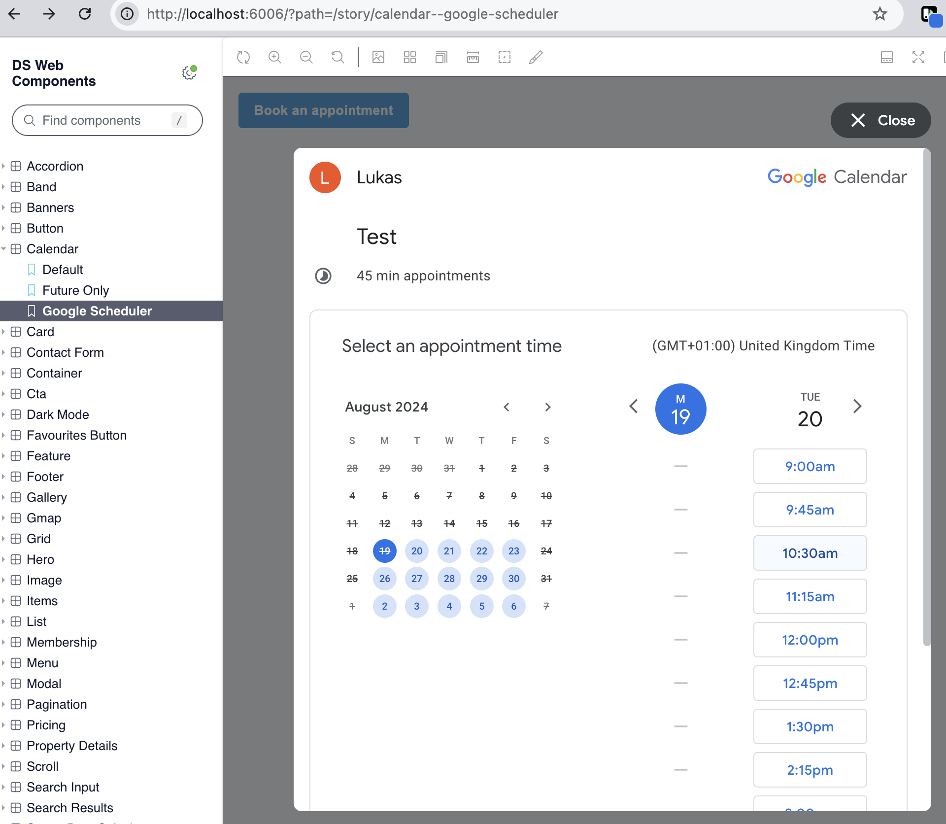 Google Scheduler Code wrapped in web component
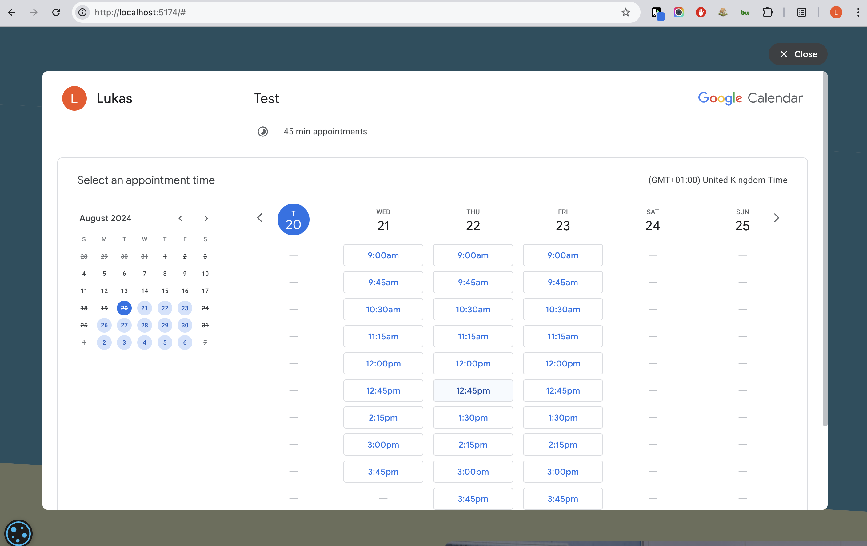 Google Scheduler used on the website
Create stories
To add a story to your project create a new file in your component directory.
File should be named as follows:
<component-name>.stories.js
Now you can add your story to the file. Start with importing web compoent and html from lit. Each storybook story returns a template. Each story can pass arguments to a template which can be used to change the component state.
import { html } from 'lit';
import './stampduty.js';

export default {
  title: 'Stamp Duty Calculator',
  component: 'stampduty',
  argTypes: {
    price: { control: 'text' },
  },
  parameters: {
    cssprops: {
      'stampduty-primary': {
        value: 'hsl(120deg 50% 75% / 49%)',
        description: 'primary',
      },
    },
  },
};

const Template = ({ price }) => html`
  <stampduty price=${price}></stampduty>
`;

export const Default = Template.bind({});
Default.args = {
  price: 100000,
};
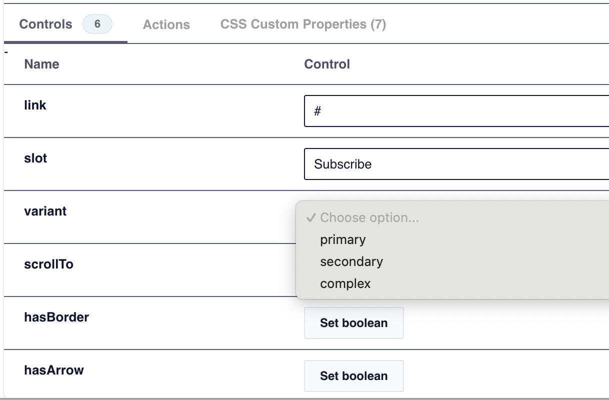 Storybook controls
Storybook extenstions
Storybook extensions, or addons, elevate the Storybook experience by adding powerful features that go beyond basic component previews. These extensions provide tools to test responsiveness, accessibility, interactions, and more, directly within Storybook. For example, the Actions addon lets developers track events and interactions, making it easy to test component behavior without writing extra code. Controls and Knobs allow for real-time adjustments to component props, helping visualize various configurations quickly. With Accessibility (a11y) and Viewports addons, developers can verify accessibility standards and responsive design in one place. By incorporating these extensions, teams can create well-tested, accessible, and flexible components efficiently.
CSS Pproperties
One of the most useful extensions is css properties. It allows you to see all css properties used in your component. It is very useful when you want to see how your component looks with different css properties. It also allows you to change css properties in storybook. This is very useful when you want to see how your component looks with different css properties.
I have set bg-[var(--stampduty-primary)] css property in my component. Now in storybook I can see that this property is used and I can change it to see how it looks with different values.
To add css properties to your storybook story you need to add it to your story file. You can add it to your default export. You can add as many properties as you want. Each property should have a name, value and description. Follow example below:
  export default {
    ...
    parameters: {
      cssprops: {
        'stampduty-primary': {
          value: 'hsl(120deg 50% 75% / 49%)',
          description: 'primary',
        },
      },
    },
    ...
  }
CSS Properties
Conclusion
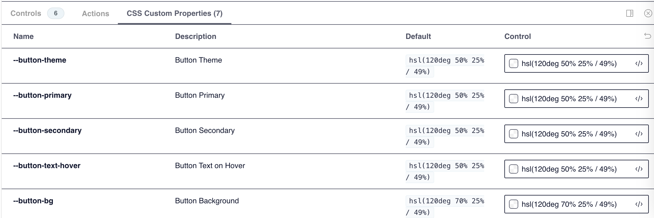 CSS Properties
Storybook is a great tool for working with web components because it makes development faster and easier while helping teams stay in sync.
With Storybook, you can work on each component on its own, without needing the entire app running. It’s like a sandbox where you can focus on the details of each component, test it out, and see exactly how it behaves.
Designers and non-developers can check out the components directly in Storybook, which makes feedback super easy and cuts down on communication loops. It’s all right there in one place, so you can move faster as a team.
It helps keep design consistent across projects and saves time by making sure everyone has access to a single source for components.